


Contrary to popular belief, making your website more effective doesn’t have to mean tearing it down and starting from scratch.
Depending on the state of the site, sometimes you can get great results – like increasing lead generation and making more sales – by simply tweaking the copy and design.
Tweaks can include things like:
- Rearranging content
- Adding or removing sections or pages
- Clarifying the product/service/offer
- Making headlines/subheadlines more persuasive
- Making copy more scannable with bullets, icons, etc
- Making CTA’s more consistent, actionable & persuasive
- And more!
To illustrate, I’m sharing 5 simple tips for making your website copy more effective using one of my former clients, WPMaintain, as the example throughout.
WPMaintain offers wordpress maintenance support for UK-based businesses, and between 2020 and 2021, I helped the team revamp a few key pages on their website to make them more effective.
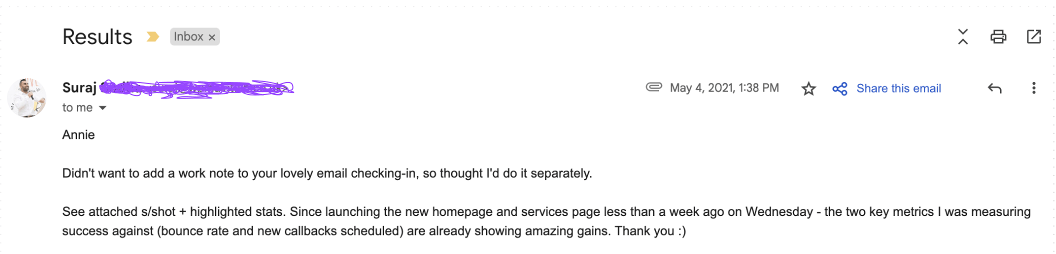
The changes weren’t massive, but quickly produced desirable results:
Side note: After working together on the project, I actually became a customer of WPMaintain and cannot say enough great things about them! Everything we wrote in the website copy is true. If you need WordPress support, WPMaintain is the absolute best. No, I’m not an affiliate, just a fan ✨
Like I said, the project wasn’t a massive lift – it was about using research to optimize what was already there.
Check out the tips and examples below to see what I mean – and to get ideas for how you can improve the effectiveness of your own website copy.
And if you’re ready to make real progress on your site, check out my website bootcamp here.
Alright, let’s get into it, starting with the most important part of any website – the hero.
#1: Treat the hero like it’s the only thing visitors will see
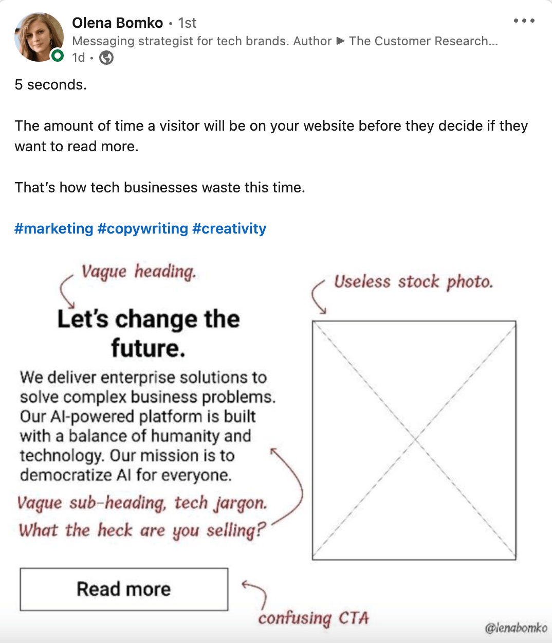
According to Hubspot, the average time spent on a single webpage (across all industries) is 54 seconds.
But I would argue that you only have about 5 SECONDS to grab a visitor’s attention (as is illustrated below by messaging strategist, Olena Bomko):
This is why the hero spot is so important – and why you should treat it like it may be the only thing a visitor sees before making the decision to stay or leave.
To do that, your hero needs to clearly explain what you’re selling, what makes it special (or why someone should buy it), and what action they should take next.
Of course, doing research to understand your audience (like their stage of awareness, level of intent, etc) can also help you make decisions around content, but following the guidelines above is a good start.
In the case of WPMaintain, the hero wasn’t terrible, but needed a bit of tweaking to make sure it was conveying the right information in the most effective way possible.
Here were some of the issues with the original hero:
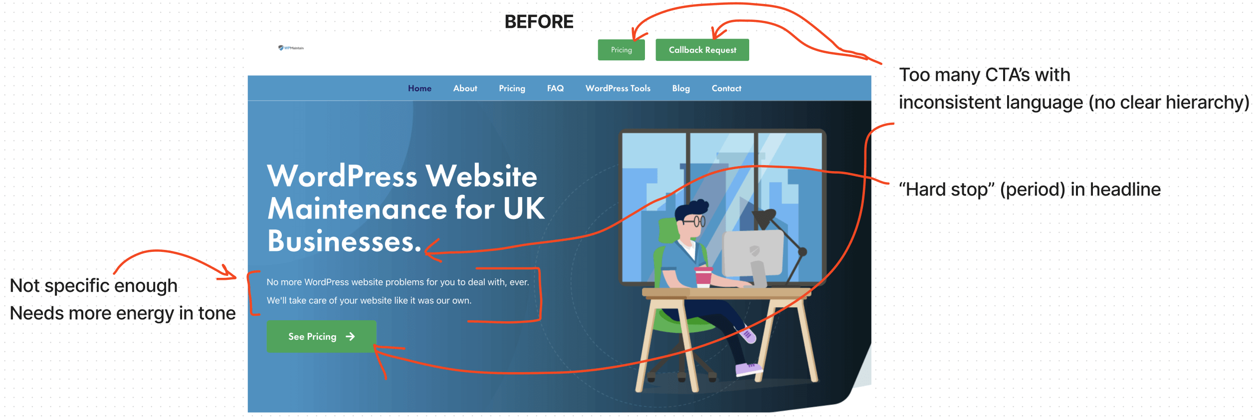
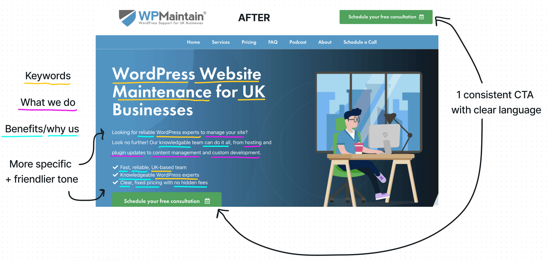
To amp things up, we made a few adjustments including:
➔ Consolidated + updated the CTA’s
Instead of having 2 CTA’s that were competing with one another, we opted for 1 CTA that best supported the client’s goal (getting leads on the phone so he could have a conversation with them).
➔ Made the CTA friendlier + more personal
“Schedule your free consultation” sounds warmer and more personal than “See pricing” or “Callback request” – which sound colder and more transactional.
While subtle, this change is important because the service is such a core component of the product – we want to make sure the copy reflects the same friendly tone we’re promising.
➔ Incorporated more keywords
As you can see from the “before,” we didn’t change the headline for SEO reasons, but we did incorporate more keywords into the subheadline and bullets to capture additional organic traffic.
As a result, the site ranks on the 1st page of Google for the keywords we used – which is important as organic search is a decent chunk of their traffic.
➔ Clarified the offer + added examples
Using phrases like “manage your site” and “hosting, plugin updates, content management, and custom development” – we added these in because we know visitors are looking for these specific services.
➔ Highlighted specific benefits/differentiators that are important to the target audience
Through the research (which included customer interviews, review mining, and competitive analysis) we learned what the target audience has been BURNED BY and what they’re looking for now.
This is why we opted to use words like “reliable,” “knowledgeable,” “can do it all,” and “fast” to describe the service. And why we used “clear, fixed pricing” and “no hidden fees” to describe the pricing structure.
Basically, the opposite of what they had experienced in the past.
➔ Made the tone warmer + more upbeat
As mentioned above, the brand claims to be friendly, professional, easy to work with, etc. As a result, the copy should reflect a warm, caring, and positive energy. Consistency + congruence = trust!
#2: Make the most of your “proof”
Proof can be all kinds of things, from reviews and star ratings to case studies, research evidence, endorsement from an authority figure, before/afters (like in this article!), and more.
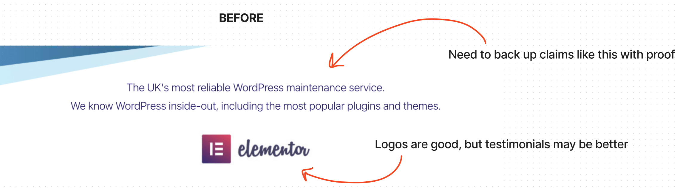
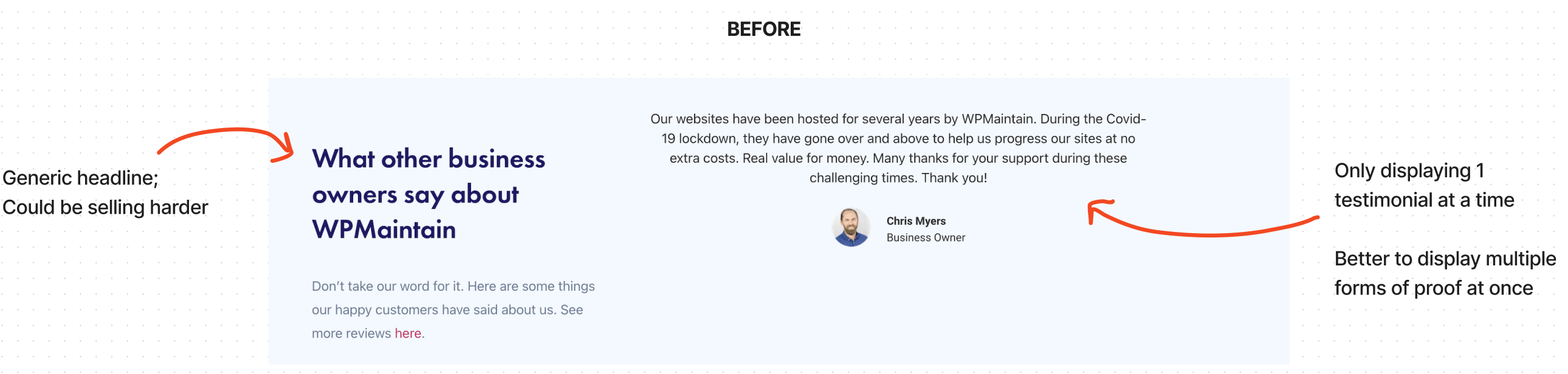
While most websites strive to incorporate proof in some way, many – including my client’s original Homepage – don’t always make the most of it.
In the examples below, my client strategically used logos from past/current clients and testimonials as a form of proof and added some copy to enhance it.
The problem is, there wasn’t a “juicy” headline to provide context or information; and the proof could have been a bit more specific – and there could have been more of it.
And finally, if you’re going to make bold claims like “The UK’s most reliable WP maintenance service” you should have some kind of proof to back that up.
Here’s two “proof” sections from the original Homepage to show you what I mean:
To amp things up, we made a few adjustments including:
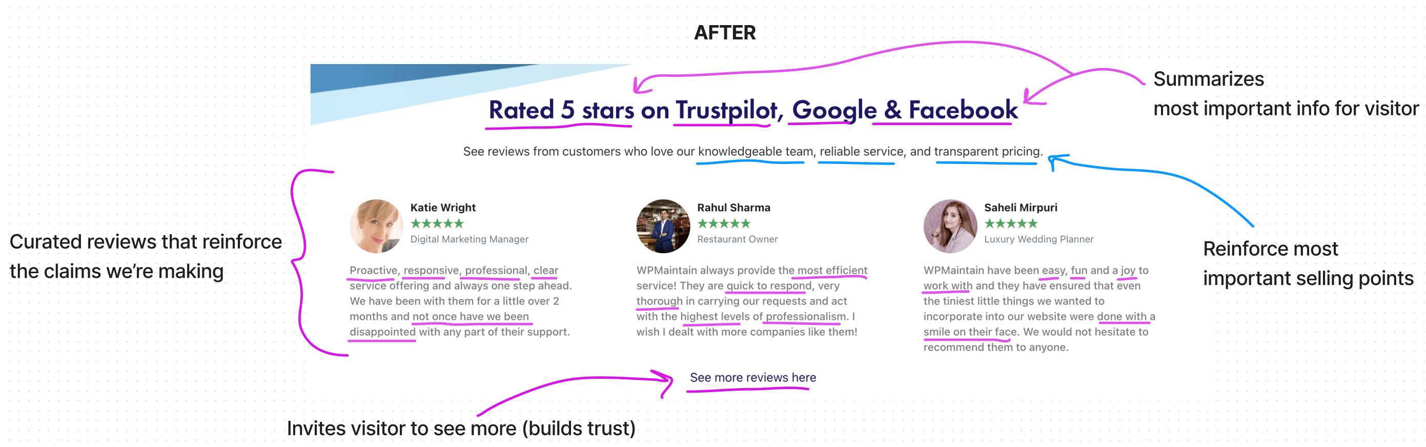
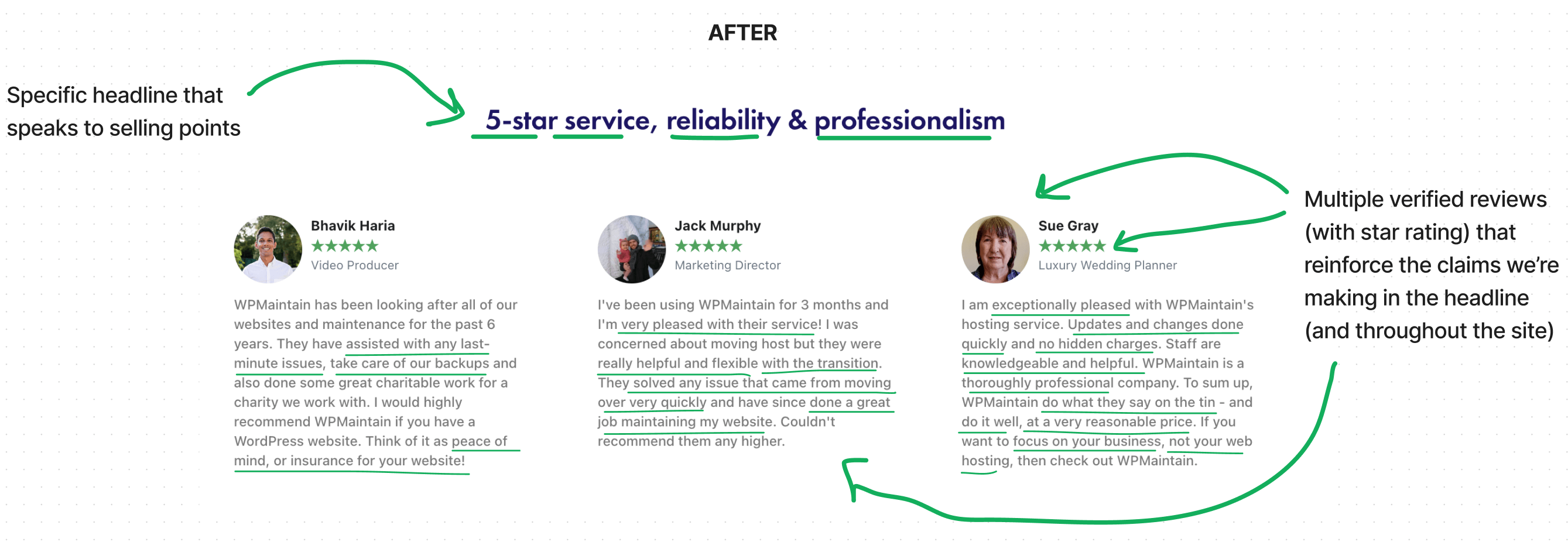
➔ Added headlines that provide context + highlight the most important information
The majority of visitors (90%) are scanning and only reading the headlines (if at all), which is why it’s so important to make sure each headline is as specific and descriptive as possible.
In this case, we used a headline that “summarizes” the key proof points (rated 5 stars across multiple reputable platforms) to inform and persuade even the fastest of scanners.
➔ Added subheadlines that reinforces the most important selling points
Visitors are not reading everything on your site – they’re “picking and choosing” as they scan, so in some cases, it can be good to repeat important information in key places.
This is why we opted to repeat some of the important selling points – like expertise, reliability, and transparent pricing in the subheadline.
➔ Curated reviews to reinforce the claims we made above
One of the best ways to make your claims more effective is to back them up with proof, which is why we selected specific reviews to reinforce the claims related to the service (i.e. speed, proactivity, responsiveness, professionalism, etc).
➔ Added a CTA to build trust
Giving visitors the option to see additional verified reviews signals transparency – which can translate into a feeling of trust and legitimacy.
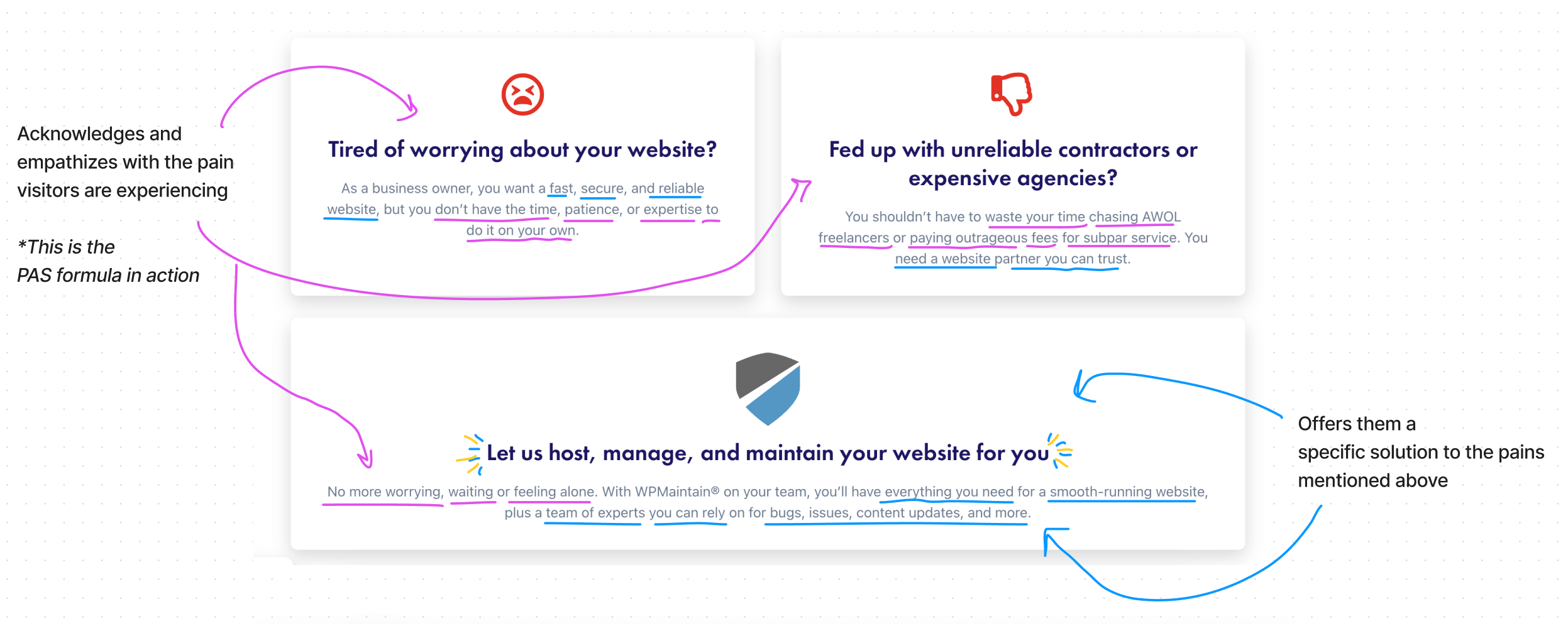
#3: Address “the problem” to show that you understand & empathize with their pain
While not always appropriate, directly addressing pain points through a formula like PAS (Problem, Agitation, Solution) can be an effective way to build trust and connection with the target audience.
During the research process with the client, we learned that the target audience is very likely to be nontechnical and lacking the time/energy/expertise to manage their own websites.
We also learned that a good chunk of the target audience has had negative experiences with similar services in the past – and that many of them would fall within the “Solution Aware” stage of the sales funnel.
For this reason we opted to add a section within the Homepage that speaks directly to the target audiences’ pain points and past negative experiences; this allowed us to:
➔ Show that we understand & empathize with their pain
Because my client has worked with hundreds of customers, they know exactly what leads are going through and how they feel. Getting specific – and using specific examples – is key here.
➔ Offer a specific solution that delivers pain relief (past, present, future)
Similar to proving that we understand their pain, we must also present them with a solution that will not only help them avoid the pains from the past and present, but avoid future pain, as well.
#4: Highlight your USP’s / differentiators in clear & specific ways
Most businesses know the importance of standing out from competitors, but few know how to communicate their differentiators in clear and specific ways.
And most haven’t conducted the research (including talking to their own customers or conducting a competitive analysis) to make sure they’re focusing on the right stuff.
This results in “why us” sections that don’t feel persuasive, or feel like carbon copies of the competition – which makes it even more difficult for visitors to make fast and confident choices.
In the case of my client, he had the right idea of creating a “why us” section and focusing on a couple of benefits, but “saves time and money” are not specific or differentiated – any brand can claim the same things.
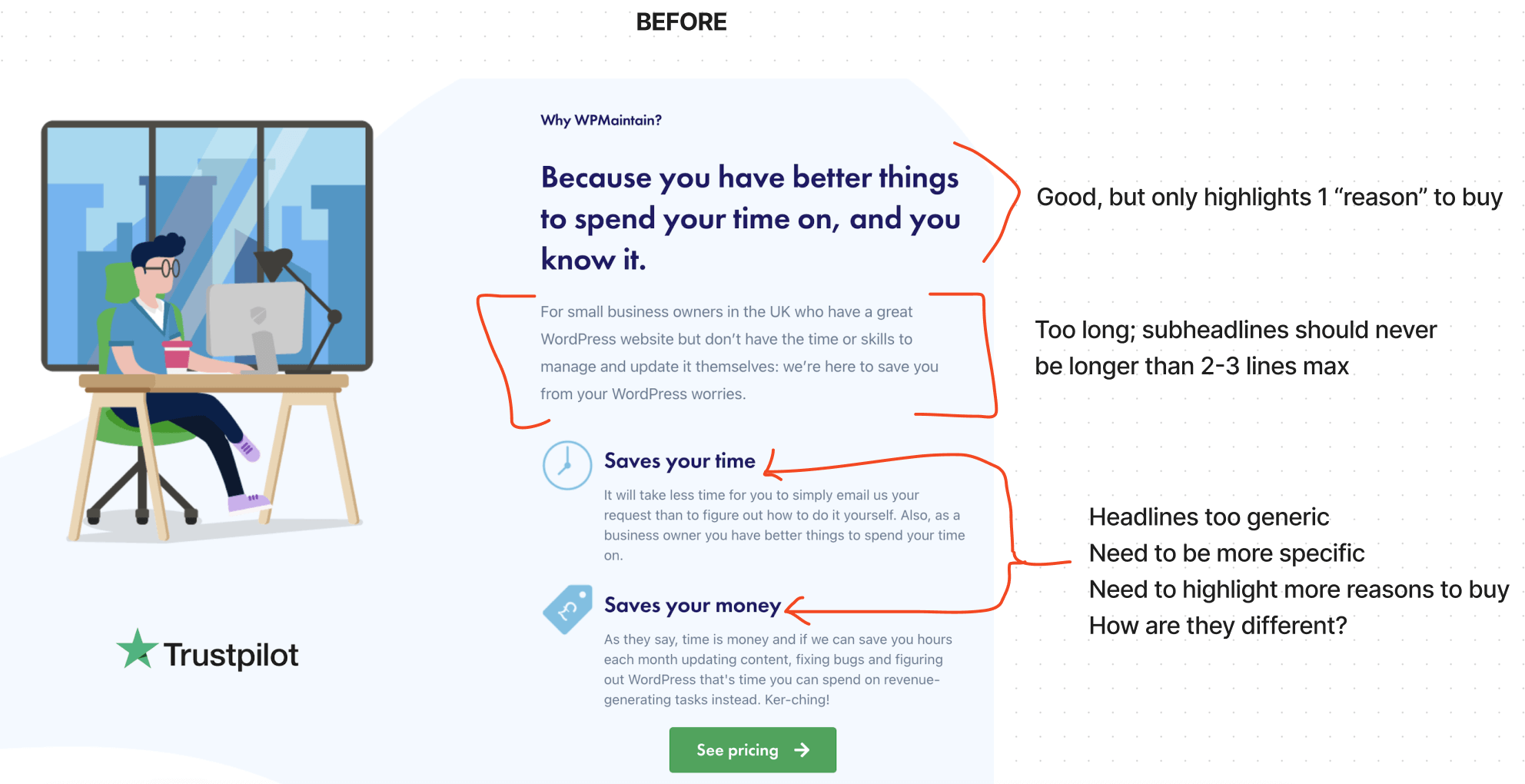
To remedy the challenges noted above, we made a few adjustments including:
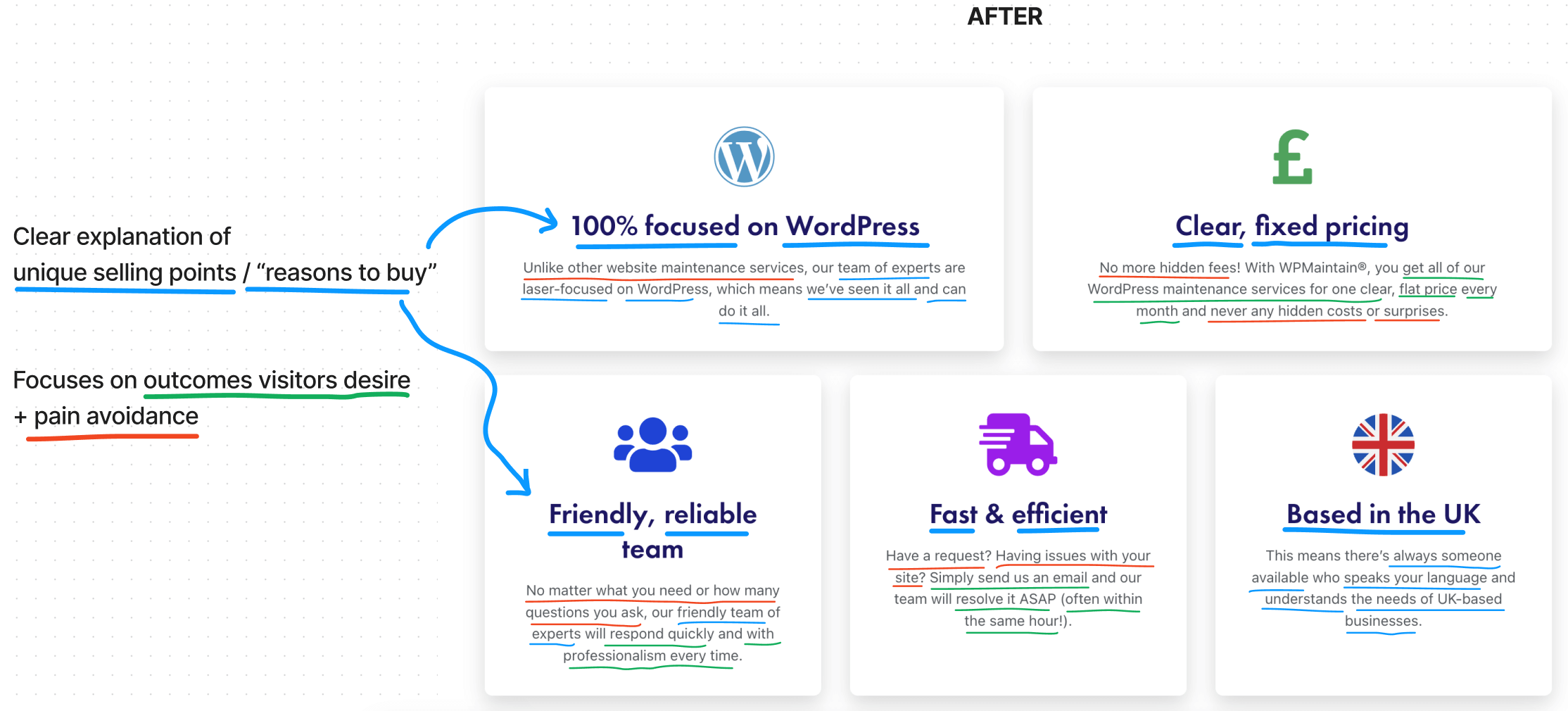
➔ Highlighted the 5 most important differentiators
And we didn’t just pull them out of thin air; they were carefully selected based on customer and competitive research, as well as input from the client (who frequently communicates with leads).
➔ Incorporated USP’s & desirable outcomes throughout subheadlines
Highlighting your differentiators is just the first step. You must also connect your differentiators to your target audiences’ desires, so they understand why each differentiator matters to THEM.
➔ Incorporated “pain avoidance” to further highlight differentiation
There is nothing humans hate more than experiencing pain – and many of us will do anything possible to avoid it.
This is why we must remind visitors of the negative experiences they’ve had in the past and show them how we’ll help them avoid those things in the future.
➔ Make each section simple & scannable
Instead of burying the important stuff, we called out each differentiator in a headline, paired it with a short explanation, and added an icon to provide visual cues that reinforce each differentiator.
Each section is clear and concise, and you can easily understand what makes them different (or why you should buy) in a matter of seconds.
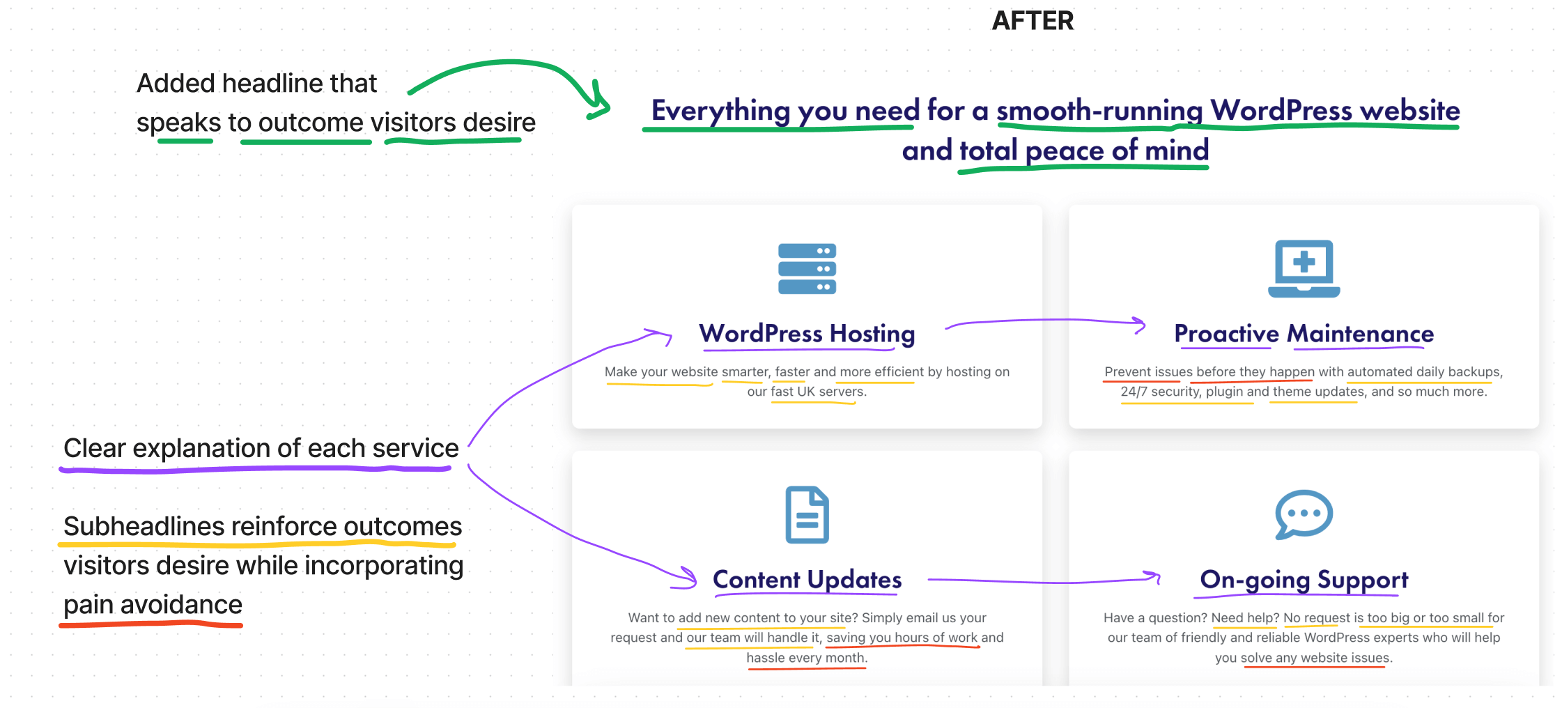
#5: Clearly explain what you’re selling & why someone should buy
One of the biggest challenges businesses face when it comes to copywriting is knowing what to focus on and when.
Because they’re not sure which parts of their products will be most appealing to visitors, they usually guess and end up focusing on the wrong stuff in the wrong places.
This can lead to confusion, as visitors can’t quite discern what exactly the business is selling or if it’s the right choice for them.
In the example below, my client chose to highlight certain selling points (content management, security, and locality) in what was essentially a “services” section, but it wasn’t giving visitors the full picture.
On top of that, the research told us that the “comprehensiveness” is one of the most important factors for the target audience, yet there was nothing in the service section about that.
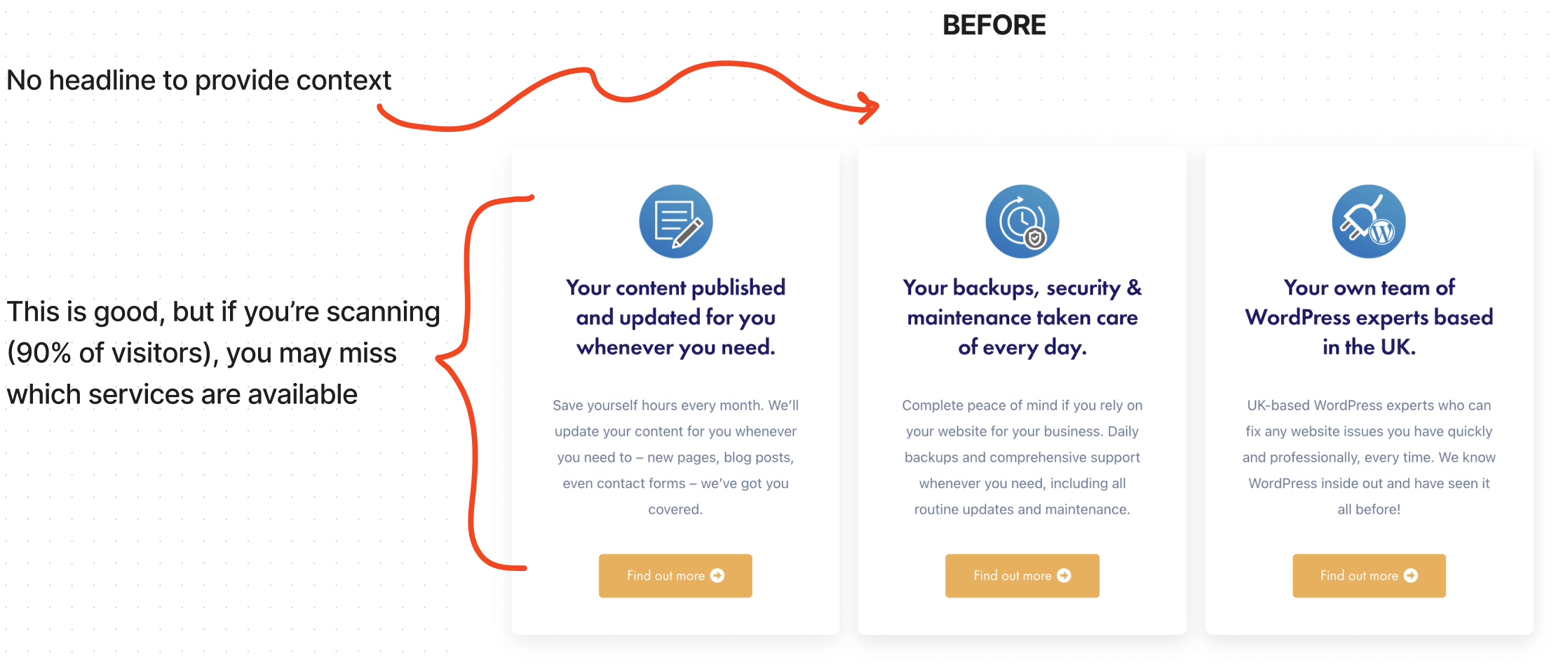
To remedy the challenges noted above, we made a few adjustments including:
➔ Added a specific headline that speaks to the outcomes visitors’ desire
This added context to the section while also highlighting the comprehensiveness of the service (“everything you need”) and the outcomes visitors’ desire (like a “smooth-running website” and “total peace of mind”) – all of which were informed by the research.
➔ List all services to highlight comprehensiveness
By clearly calling out each service, visitors can quickly see what the business offers and what’s included with each. And if they’re looking for something specific, they can easily see if it’s available.
➔ Rewrote subheadlines to reinforce desirable outcomes
Using the research insights, we rewrote the headlines to highlight specific outcomes visitors are looking for like a “faster, more efficient website” and “automated daily backups.”
➔ Incorporated “pain avoidance” where relevant
As mentioned in the section 4 above, humans will do anything to avoid pain. For this reason, we use copy to highlight the pain they’ve experienced previously and show how we’ll help them avoid it in the future.
Ready to optimize YOUR website (without giving it a total facelift)?
As you can see, making a website more effective at generating leads or sales doesn’t always require a total revamp.
Many times, it’s as simple as applying research in ways to make what you have clearer, more persuasive, and more enjoyable to use.
The bootcamp is just 4 weeks and includes tips similar to what was covered in todays’ article, plus weekly personalized feedback from me at every step (cart opens January 23rd).
The personalized feedback is very similar to what you saw above – I’ll review your work and give you tips and suggestions for how you can make your copy / UX / design clearer and more effective.
If you have questions about the article or bootcamp, comment below or email me directly: annie1maguire@gmail.com
Either way, I hope you found these tips helpful and have a clearer sense of how you can optimize your website to make it a more effective sales tool.


