


Guest post alert! This article was written by designer, product creator, and speaker, Laura Elizabeth. Laura is the creator of Client Portal, Design Academy, and Project Pack. Take it away, Laura!
Good design is expensive.
And anyone who’s tried to hire a design agency will tell you that it’s not cheap, either.
But design is also something every business needs.
Whether it’s something big like a website or logo, all the way down to blog post images or a Facebook ad – you need to be creating visuals constantly.
Fortunately, there are many tools these days that make designing more accessible for non-designers. But even with these tools you may find yourself unhappy with the end result, yet unable to justify the cost of hiring a designer or agency.
I’m Laura Elizabeth ???? and I’ve been a designer for over 10 years. I studied design at university, worked in a design agency, and as a freelancer. I also created an online course teaching design to over 1,000 students worldwide.
In this article I’m going to distill everything I’ve learned into 10 simple ways you can improve your design skills so you can churn out gorgeous assets – without hiring a designer.
Let’s jump in!
1) Keep your branding consistent. Create a design toolkit – and stick to it
When you’re designing, the most important thing to think about is creating a consistent brand identity for your business. There are hundreds of different design styles out there, but you need to choose one design style for your brand and stick to it.
If every design you create uses different fonts, colours, and images, your brand will look disorganised and amateur. It’s much better to have a simple but consistent brand than something unique but disjointed.
The best way to ensure your brand stays consistent is to create a design toolkit with all of your branding elements that you can easily reference when creating new assets.
When developing your design toolkit, think about all of the components a designer would need in order to create branded assets for you.
At a bare minimum, you’re going to need to collect:
- Your fonts
- Your colour scheme
- Any illustrations you use
- Your chosen icon set
- A folder of photography
- And maybe some of your most used templates, like a slide deck, featured images, ad templates etc.
You don’t need to create a fancy brand guidelines PDF (unless you want to); simply keep them in a folder on your computer so you can access them when needed.
I also recommend sticking a post-it note on your computer with your HEX colour values so you always have access to them without needing to dig around (trust me, you’ll need these values a lot).
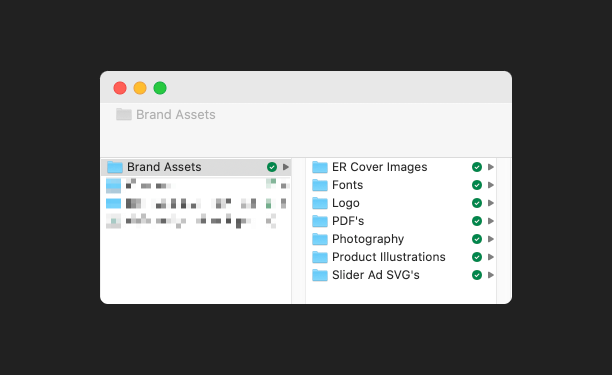
Keep your brand assets easily accessible in a folder on your desktop
2) Keep a swipe file of inspiration
Gathering inspiration is a huge help when designing, but most people wait until they need something to reference before looking for it. And if you’re anything like me, when you’re looking for something specific, you’re not going to find it.
You should constantly be collecting inspiration. Every time you see something you like, whether it’s an entire website, an interesting image, or a great illustration style – save it for “future you” and you’ll thank yourself later.
When you see something you like, save it in a dedicated bookmarks folder in your browser or use a tool like Pinterest or Dropmark (these have the benefit of easy tagging and organisation); alternatively, you can always keep an “inspiration” folder on your desktop.
My personal favourite is keeping inspiration in a folder on your computer organised by asset type (e.g. Web Components, Facebook ads, Promo Images), so any time you need to create a new asset, you can look through some layout options, overlay your content and branding, and you’re done!
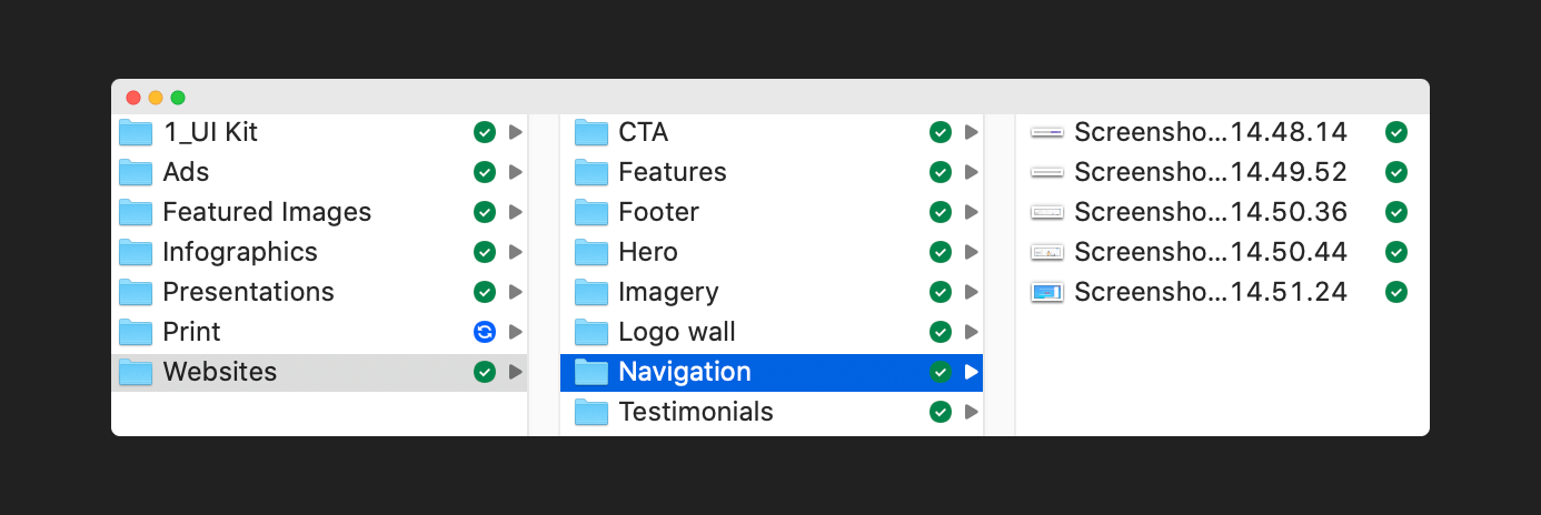
Keep an inspiration folder full of assets and ideas
3) Utilise templates – but don’t go overboard
You can find a template for almost anything you need to design. For example, Canva is a free(ish) design tool that has a huge library of ready-to-use templates.
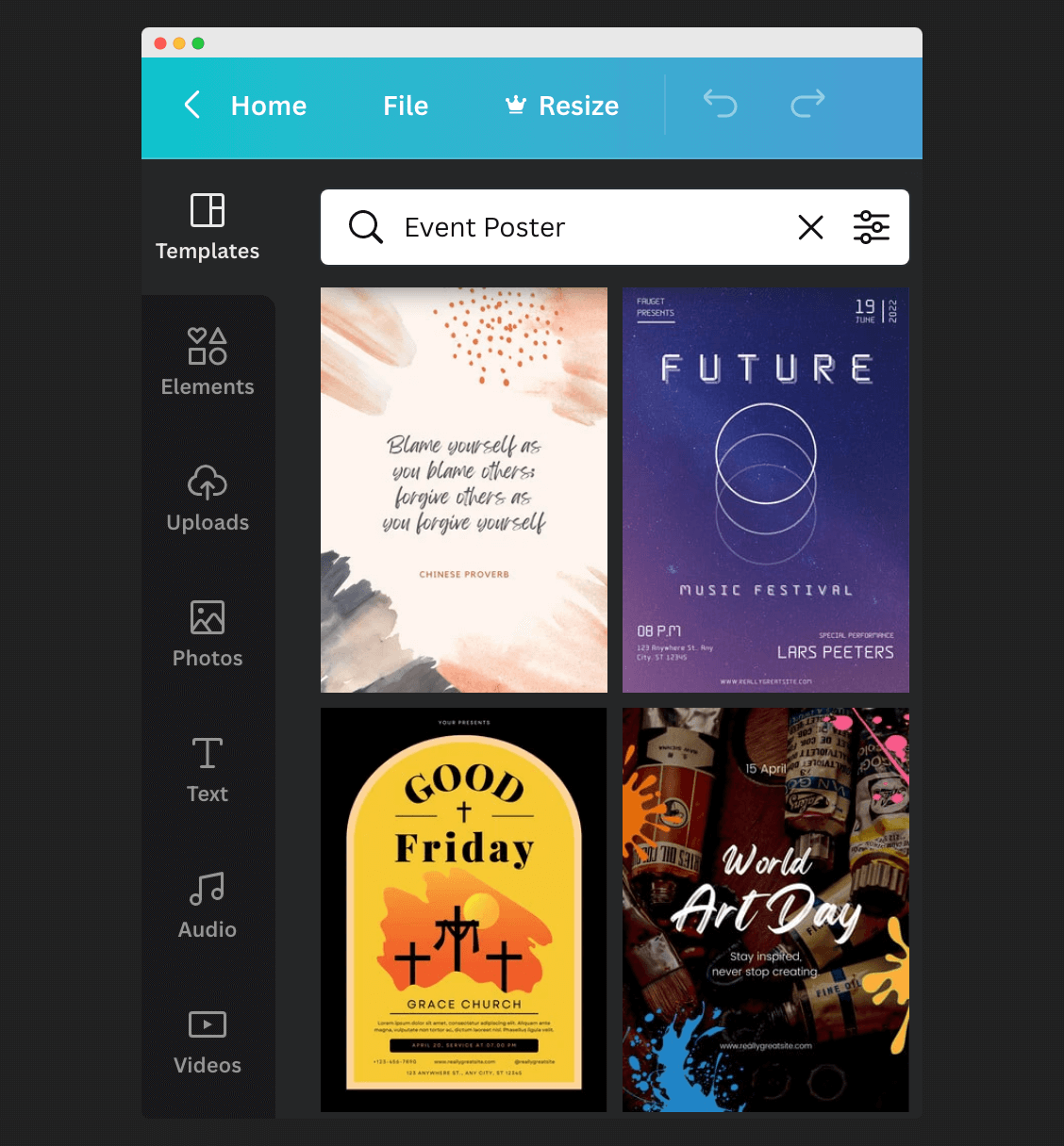
Canva has numerous ready-to-use templates
At first glance, these might seem perfect. Why would you ever need a designer when there are so many great templates at your fingertips?
But if you’ve ever tried to use templates before, you may have found that they can be more work than creating a design from scratch.
When you’re designing, content comes first.
The best designs are created with existing content — not the other way around — so trying to squeeze your content into a template that was designed for something else can be difficult and even downright impossible. And the end result may look miles away from what you originally envisioned.
If you have good branding, you should be able to create assets from scratch that are completely tailored to your content and have them looking just as good as a template.
But if you want to use a template, I recommend writing your content first and then choosing one that matches your content as closely as possible. This will give you the greatest chance of success.
4) Purchase a good typeface
Most people stick to free typefaces because, well, they’re free. They can also be ridiculously good quality, but in my experience, paid typefaces are infinitely better and using them can be one of the easiest ways to design great-looking assets.
If you see a design you like, more often than not, you’ll find that the designer is using a premium typeface. Premium typefaces are much better quality and can make a design stand out with minimal work on your part.
Typefaces might seem expensive, but when you consider the months, if not years, they take to create, the prices don’t seem all that bad.
That said, if you’re working on a side project that isn’t monetised, or you just don’t have the budget at this time, then free fonts can get you just as good results – albeit with a bit more work on your part.
If you ever get the opportunity to use a premium typeface, give it a go and you’ll see how great they can be.
Imagine being able to make a full slide deck in less than an hour using just your typeface and a couple of colours, and having it look more professional than 99% of other slide decks out there. It’s a pretty great feeling, and that’s what good branding can do for you.
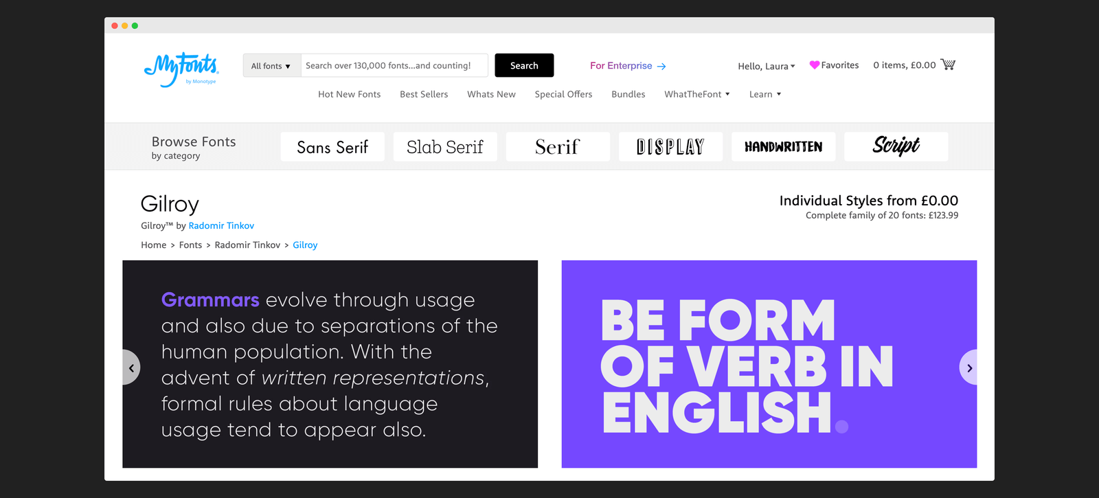
Gilroy is one of the many high quality typefaces you can purchase from MyFonts
I use MyFonts to source most of my typefaces, but you can also find great ones from independent font foundries like Lineto, Klim, and Mulieu Grotesque.
5) Source high-quality imagery – and look for images of people
Sourcing imagery can be a painstaking process. But it’s worth spending the extra time finding the right imagery for your brand.
When searching for imagery, stay clear of overused imagery like coffee shops or anything too travel related (unless of course, you’re a coffee company or travel blog).
You want to look for something relatively unique. Granted, on a free stock website, you can’t guarantee uniqueness, but try to go a little further than having a generic “guy on top of a mountain with his hands up in the air” image as your main hero (unless you want to look like just another blog).
Steer clear of generic stock photos in your designs
Here’s another tip: People respond really well to seeing other people. It adds a human touch to your business and brings about feelings of connection and belonging.
For this reason, I always like to have a least a few faces on every marketing website I design, whether it’s testimonials, team photos, or just stock images to resemble customers.
Here are some good examples of a websites that uses high-quality images of people – both customers and stock or staged images – throughout their website. Notice how they’re focusing on the people using their product rather than the product itself? It provides a community feel and makes you feel like you want to be a part of that.
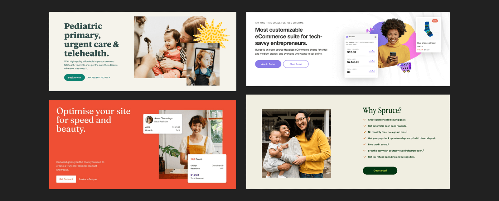
Include pictures of people to make your designs welcoming and authentic
So always be looking for images with people in – it’s a fine line between authentic and downright cheesy, but getting the right people images can make a big difference.
If you can’t find the right images, don’t worry — it’s better to have no imagery at all than bland, generic images that clutter up your design and add nothing of value.
6) Take extra care when displaying screenshots
Depending on your business, you may need to display screenshots regularly.
For example, if you have a software product, you’ll be showcasing screenshots on your website and sharing them on social media. If you have a blog, you’ll be screenshotting examples to back up your articles.
When you’re screenshotting, put some thought into how you’re actually framing the image with these simple tips:
- Don’t include desktop backgrounds or cut off words in the middle of a screenshot
- Make sure the padding and spacing is equal around your screenshot
- Try to block out any information that the user doesn’t need to see
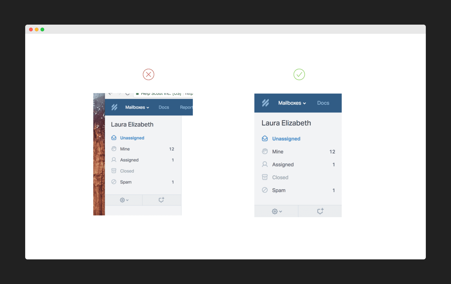
Take care when framing your screenshots
A tool I love to use for my screenshots is Screely.
Screely puts your screenshot onto your brand colour background (another reason to have your brand colours easily accessible) and adds a simple browser toolbar at the top to make it look super professional.
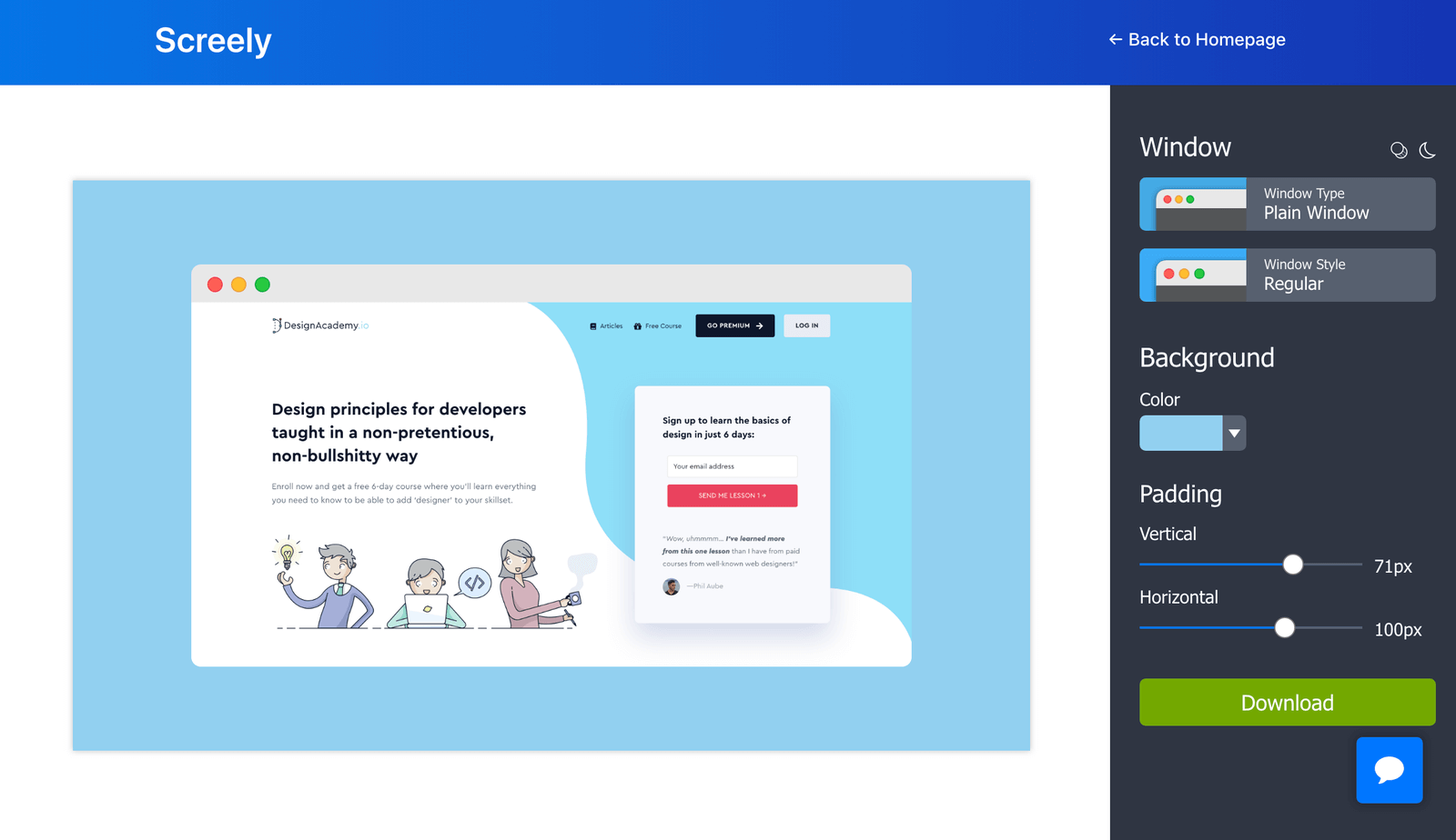
Use a tool like Screely to make your screenshots stand out
7) Don’t mix and match icon and illustration sets
When creating an asset like a featured image, ad banner, or cover photo, icon and illustration sets can help add an extra bit of polish.
Instead of trying to source that “perfect” image as you go, it’s much better to have a few, high-quality images (like icons or illustrations) that you can reuse in multiple places. Not only will this help your brand become more recognisable, it will also keep it consistent.
Remember, different icon and illustration sets have different design elements that make them unique. When you mix and match these, it creates an unpolished, inconsistent feel to your brand.
Icons can vary in style drastically and look inconsistent when mixed together
My favourite resource for illustrations is the Get Illustrations packs. I recommend choosing one that you think would be the most flexible for your brand and sticking with it.
For icons, I’ve used FontAwesome for years (it’s pretty much my go-to for any icon imaginable). Each icon comes in Solid, Line, and Duotone so you can ensure you have complete consistency no matter which icon you choose.
FontAwesome has a huge collection of icons all designed to work together
And don’t forget, you can (and should) edit the colours of your icons to match your brand.
If your icons are going to be grey – make them your grey. If your icons are going to be coloured, make them your brand colour. You can use almost any design software to do this, whether it’s Sketch, Figma, or Canva.
It can be fiddly, but it’s worth it.
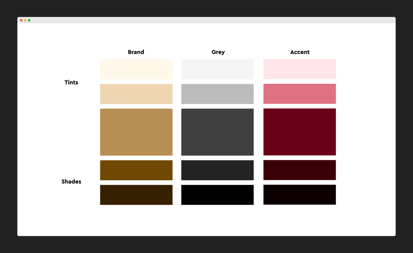
8) Use tints and shades of existing colours before adding new colours
Most brands can get away with a one or two-colour palette. Here’s how these are typically made up:
One-colour palette
- 1 brand colour (this is used as your accent colour)
- 1 set of background/text colours (minimum: 1 dark, 1 medium, 1 light)
Two-colour palette
- 1 brand colour
- 1 accent colour
- 1 set of background/text colours (minimum: 1 dark, 1 medium, 1 light)
This might not seem like a lot, but for the vast majority, this can give you enough flexibility to have a consistent yet interesting brand.
If you need to add a new colour, try adding a tint or a shade of one of your existing colours first.
A tint is a lighter version of your colour. And a shade is a darker version.
To create a palette of tints and shades for your brand, use a Tints and Shades Generator which should give you enough flexibility for any design asset that you need to complete.
So instead of thinking of your colour scheme like this:
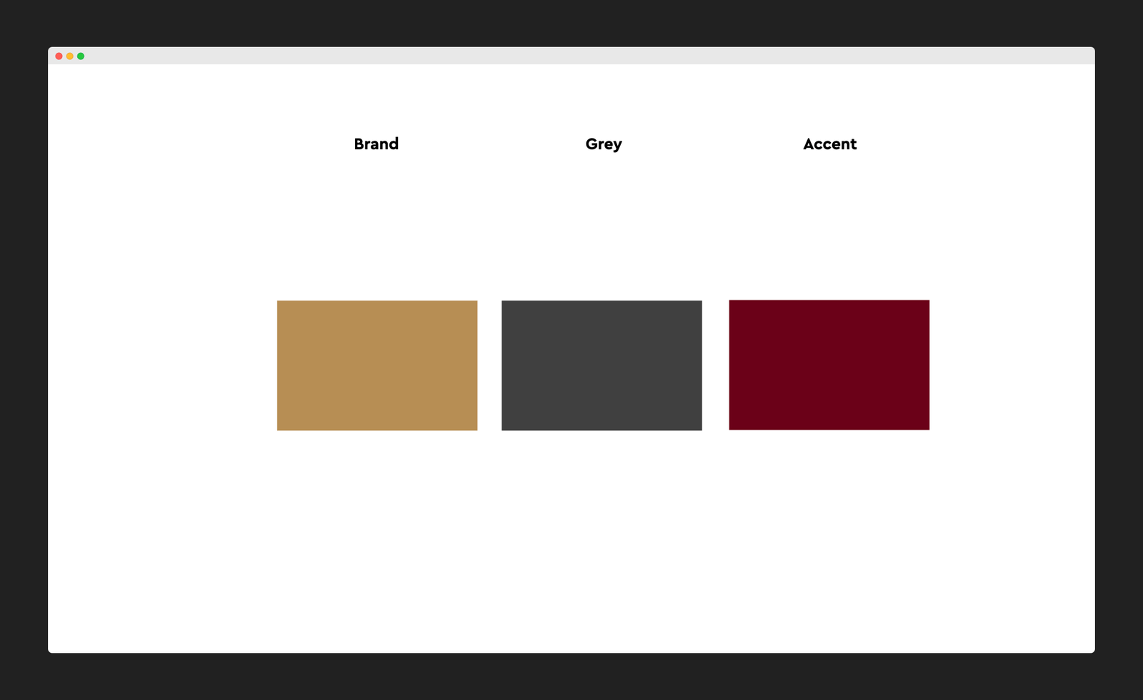
Think of it as something more like this:
9) Take colours from existing images or designs
This is an easy one, but it’s something I do constantly that makes a big difference to my designs.
When looking for a colour to use in your design, try using the eyedropper tool to take colours directly from images themselves.
If you have an image that you are definitely using in your design, look for colors within the image that can complement the rest of your branding.
Here’s an example of a colour scheme taken from a featured image; you can see how basing the colours around the imagery helps the brand look a lot more polished than basing the imagery around the colours.
Taking colours directly from images can help your brand look more polished
You might not always have the opportunity to do this — and you may also need to tweak the colours slightly to be more flexible — but when it works it can be a very effective way to find great colours.
10) Copy, but don’t steal
My final tip to help you level up your designs is to not be afraid of copying existing designs.
There’s a big difference between copying and stealing. If you are creating a web component, and you copy a layout that’s been done before, that’s perfectly okay. Chances are, that layout has been used in many different places over many years.
If you see a typeface that you really like, see what it is and consider using it for your brand. Unless the typeface has been designed specifically for that brand, you are well within your rights to buy the same typeface that someone else has.
Now, if you copy the layout, colour scheme, typography, and content, that’s definitely stealing and not okay. But you wouldn’t do that anyway.
I think most of us know what the line is between copying and stealing, so just use your judgement and you should be fine.
And if design is something that you want to learn, copying existing designs as accurately as possible is one of the fastest ways to improve your skills. As long as you don’t put them online and claim them as your own, recreating existing designs for learning purposes (or for personal use) is almost always okay.
You now have 10 ways you can improve your brand design without hiring an expensive agency
If you feel overwhelmed at any point, just remember that if you keep your brand simple, consistent, and utilise existing assets mindfully, you’re already off to a great start.
Want to deepen your design knowledge and skills (including learning about colour, typography, layout, and more)? Check out my free email course to learn the basics of design in just 6 days.


